
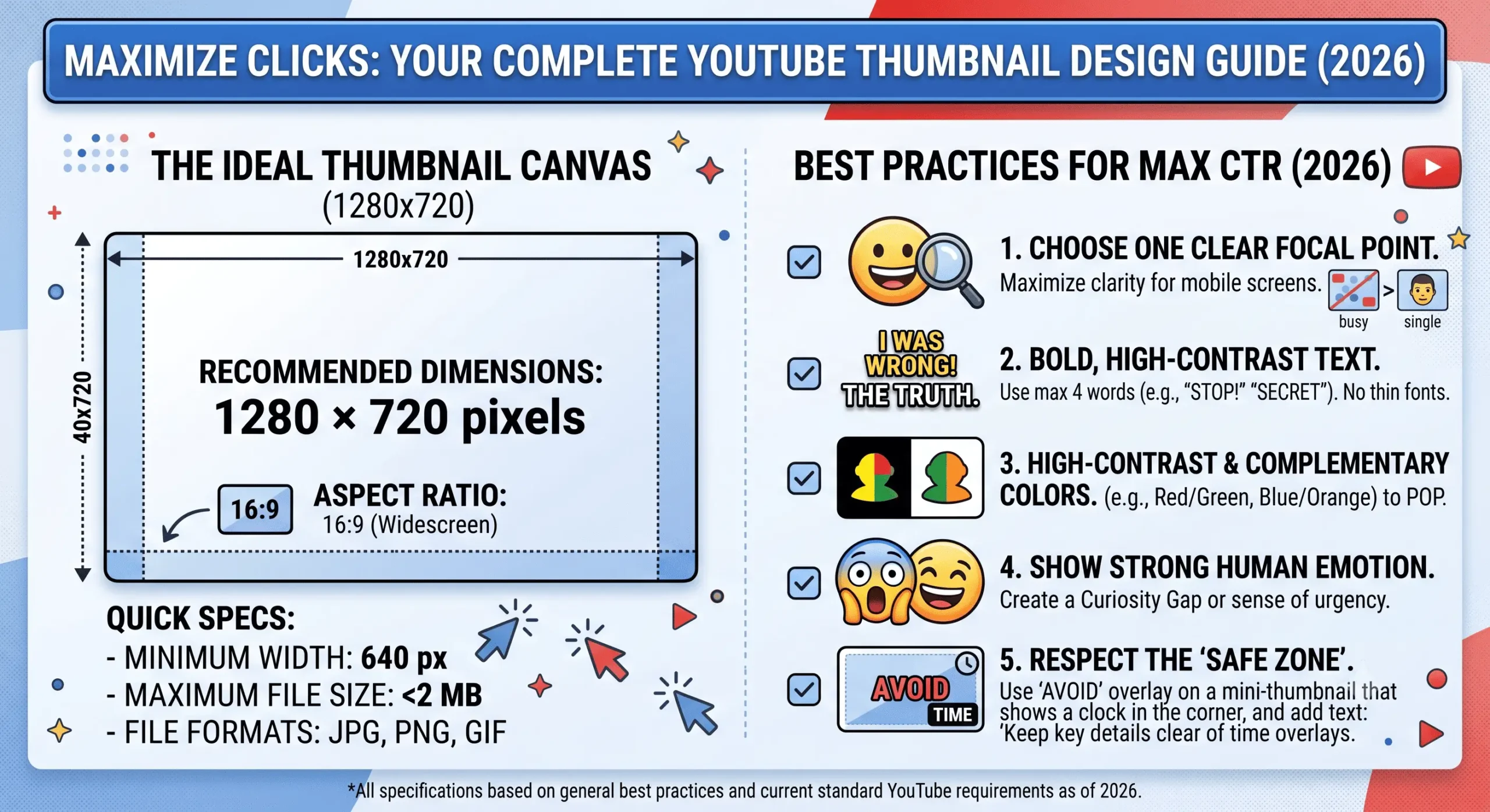
How to Design a Thumbnail That Gets Clicks: The Ultimate 2026 Guide
You can spend 40 hours scripting, filming, and editing a masterpiece, but if nobody clicks on your video, that effort is wasted. The YouTube algorithm in 2026 is ruthless, and your click-through rate (CTR) is the most critical metric deciding whether your video goes viral or dies in obscurity. If you are wondering how to design a thumbnail that gets clicks, you need to understand that it is less about creating a pretty picture and more about human psychology and visual hierarchy.
In this comprehensive guide, we will break down the exact strategies top creators use to design high-converting YouTube covers that stand out in a crowded feed.
1. Master the “Rule of Three” Elements
The biggest mistake new creators make is cluttering their design. When a viewer scrolls through YouTube on their smartphone, your thumbnail is smaller than a postage stamp. If you have five different images, a long sentence, and a complex background, it turns into a messy blur.
To design a thumbnail that gets clicks, strictly follow the Rule of Three. Limit your canvas to a maximum of three core visual elements. For example:
- A clear, expressive human face (the subject).
- A bold, high-contrast text element (under 4 words).
- A simple, recognizable background or supporting object.
By restricting your design to just three elements, you force the viewer’s brain to process the information in less than a second, which is all the time you have to earn their click.
2. Emotion and Eye Contact Stop the Scroll
Humans are biologically hardwired to look at faces, specifically eyes, and to mirror the emotions they see. A blank, emotionless stare rarely performs well. If your video is shocking, show extreme surprise. If it is a tutorial solving a frustrating problem, show relief or intense focus.
Ensure that the eyes in your image are bright, visible, and ideally looking directly at the camera (making eye contact with the viewer) or looking directly at the text/object in the thumbnail to guide the viewer’s line of sight.
3. High Contrast and Color Theory
YouTube’s interface is predominantly white, gray, and red (or dark gray in Dark Mode). To make your video pop off the screen, you need to utilize colors that contrast heavily with the platform’s UI.
Neon greens, bright yellows, cyan, and vivid purples perform exceptionally well. Use the color wheel to your advantage: if your subject is wearing a blue shirt, use a warm orange or yellow background to make them stand out. Saturation is your friend—bump up the vibrance slightly more than you would for a standard photograph. It might look slightly unnatural in full screen, but it looks perfect when scaled down on a mobile device.
4. Typography: Less is More
Your thumbnail text should never simply repeat your video title. That is a wasted opportunity. Instead, the text should act as a hook or a tease that completes the story started by the title.
- Keep it short: Aim for 2 to 4 words maximum.
- Make it bold: Use thick, heavy, sans-serif fonts (like Impact, Montserrat Black, or Anton) that are highly readable at tiny sizes.
- Use contrast: White text with a heavy black drop shadow or stroke, or black text on a bright yellow background, ensures readability against any image.
5. Work Smart: Leverage Professional Templates
You do not need to reinvent the wheel for every single upload. In fact, maintaining visual consistency helps build brand recognition. The smartest creators save hours of production time by utilizing pre-made, highly optimized graphic template bundles.
Instead of starting from a blank canvas, you can purchase premium, editable PSD or Canva layouts from digital marketplaces like Etsy, or hire specialized designers on platforms like Fiverr to build a custom template pack for your channel. Having a drag-and-drop system where you simply swap the background and change the text ensures you maintain a high CTR without burning out on design work.
6. The 10% Zoom Test
Before you ever hit publish, you must test your design. Zoom out of your image until it is roughly 10% of its original size—about the size it will appear on a mobile phone screen. Can you still read the text? Is the emotion on the face clear? Does the main subject stand out?
Another excellent strategy is to use our CoverGrabber tool to download the thumbnails of the top-ranking videos in your niche. Put your design next to theirs. Does yours stand out, or does it blend in? If it blends in, you need to increase the contrast or change your core colors.
Conclusion
Learning how to design a thumbnail that gets clicks takes practice, A/B testing, and a deep understanding of your specific audience. Keep your designs clean, your text massive, and your colors vibrant. Remember, the thumbnail’s only job is to get the click; let the video do the rest of the talking.
Frequently Asked Questions
Should I always show my face in a YouTube thumbnail?
While human faces generally increase CTR because they convey emotion and build trust, they are not strictly mandatory. Faceless channels in niches like gaming, tech reviews, or documentary essays can achieve massive click-through rates by focusing on high-contrast objects, intriguing text, or dramatic before-and-after comparisons.
What colors get the most clicks on YouTube?
Bright, highly saturated colors that contrast with YouTube’s red, white, and dark gray interface perform best. Yellow, bright green, and cyan are historically very effective because they immediately draw the eye away from the platform’s native color scheme.
How much text should I put on my thumbnail?
You should use a maximum of 3 to 4 words. The text should act as a hook and be large enough to read on a small smartphone screen. Never repeat your video’s title in the thumbnail text.