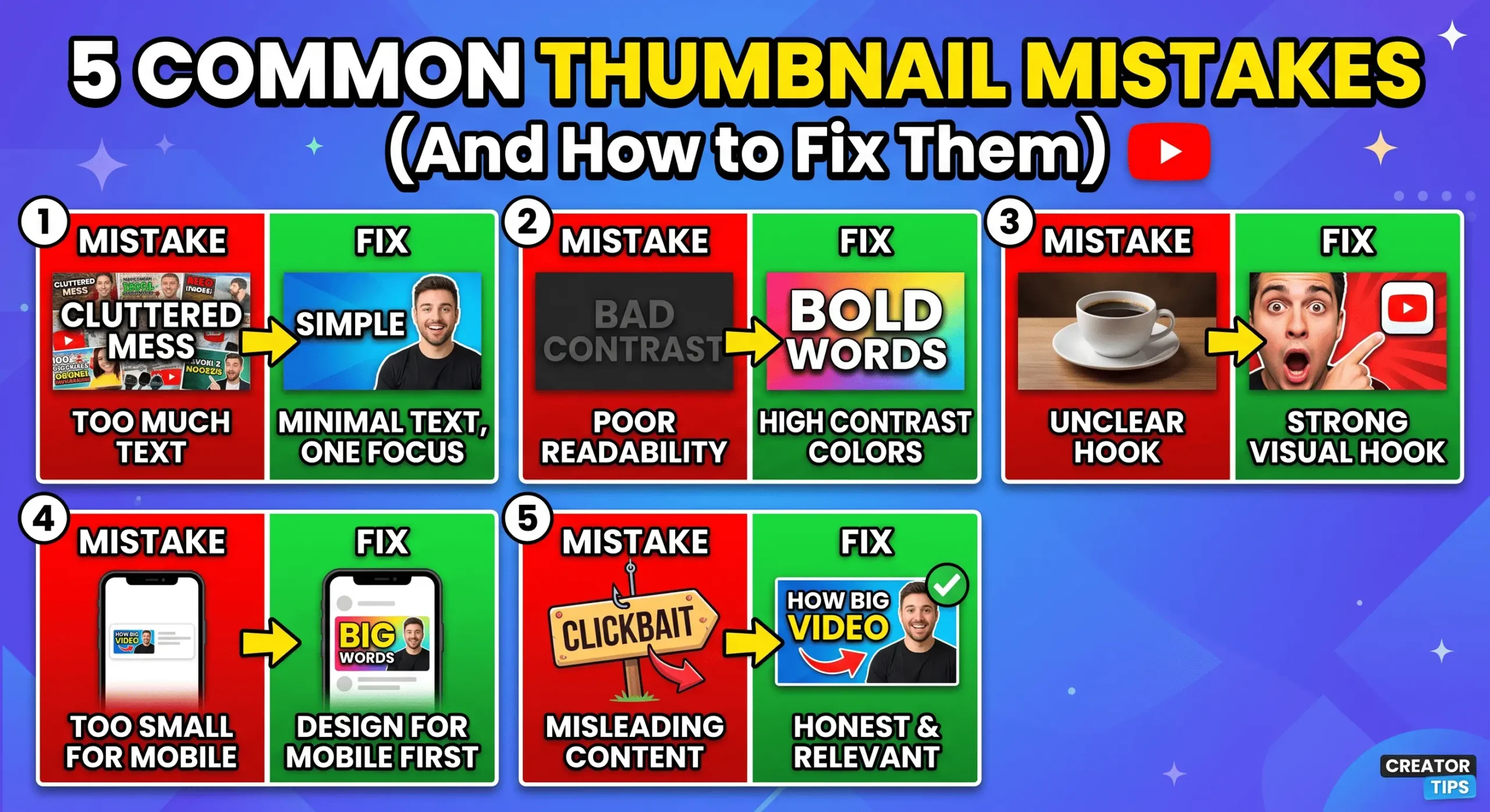
5 Common Thumbnail Mistakes New Creators Make (And How to Fix Them)
Every day, thousands of incredible, high-quality YouTube videos are uploaded, only to be completely ignored by the algorithm. Why? Because the creator treated the thumbnail as an afterthought. Your thumbnail is the packaging of your product; if the packaging looks amateurish, nobody will buy what is inside.
After analyzing thousands of videos across different niches, we have identified the most frequent errors that kill Click-Through Rates (CTR). Here are the five most common thumbnail mistakes new creators make, and the exact steps you can take to avoid them in 2026.
Mistake #1: Ignoring the Mobile Safe Zones
The majority of YouTube traffic comes from mobile devices. New creators often design their thumbnails on massive 27-inch desktop monitors, placing crucial text or logos in the bottom right corner. When the video goes live, YouTube automatically slaps a black timestamp box right over that corner, completely hiding the text.
Furthermore, failing to use the optimal YouTube thumbnail sizes (1280×720) can result in awkward cropping, pixelation, or ugly black bars on the sides of your image. Always start with the correct canvas size and keep your most important elements in the center or left side of the frame.
Mistake #2: Visual Clutter and Too Much Text
Another classic mistake is treating the thumbnail like a textbook. Adding seven different images, a chaotic background, and a full sentence of text guarantees that your design will look like a messy blur when scaled down to the size of a mobile screen.
Simplicity is the ultimate sophistication. You should strictly limit your design to three main visual elements: a clear subject, a simple background, and short, bold text. If you want a proven framework for visual hierarchy, check out our deep dive on how to design a thumbnail that gets clicks to master the “Rule of Three” and color contrast.
Mistake #3: Repeating the Video Title
If your video is titled “How to Bake a Chocolate Cake,” putting the exact words “How to Bake a Chocolate Cake” on the thumbnail is a massive waste of valuable real estate.
Your thumbnail and title should work together to tell a story, not echo each other. The title provides the context, while the thumbnail should provide the hook. Instead of repeating the title, the thumbnail text should say something intriguing like “The Secret Ingredient” or “Never Do This!” while showing a picture of the cake. This creates a curiosity gap that forces the viewer to click.
Mistake #4: Misleading Clickbait That Destroys Retention
It is tempting to use an exaggerated, shocking image to get a high initial CTR. However, if your thumbnail promises something that the video does not deliver within the first 30 seconds, viewers will immediately click away.
As we detailed in our guide explaining YouTube thumbnail SEO, the algorithm does not just measure clicks; it measures satisfaction (Watch Time and Average View Duration). If you trick people into clicking, your retention graph will plummet, and YouTube will actively stop recommending your video. Always ensure your thumbnail makes a promise that your video actually keeps.
Mistake #5: Uploading and Hoping (No A/B Testing)
The final, and perhaps most costly mistake, is treating your first design draft as the final product. New creators often spend two hours on a thumbnail, upload it, and then never look at it again, even if the video underperforms.
Top creators know that the first idea is rarely the best one. Instead of guessing what your audience wants, you need to let the data speak for itself. By actively A/B testing your thumbnails using YouTube’s native Test & Compare tool, you can upload three completely different variations and let the algorithm definitively tell you which design drives the most views and watch time.
Summary
Avoiding these common thumbnail mistakes comes down to discipline. Keep your files correctly sized, strip away unnecessary text, avoid misleading clickbait, use the text to complement the title rather than repeat it, and never stop testing new variations. Master these fundamentals, and your channel’s growth will follow.
Frequently Asked Questions
Why does my thumbnail look blurry on YouTube?
Blurry thumbnails usually happen because the uploaded image was too small (under 1280×720 pixels), or it was highly compressed before uploading. Always export your design as a high-quality JPG or PNG (under 2MB) to maintain crispness.
Can a bad thumbnail ruin a good video?
Yes. Even if your video editing and content are flawless, the algorithm relies on CTR to determine if it should push the video to more people. A bad thumbnail stops the video from being seen in the first place.
Where is the worst place to put text on a thumbnail?
The bottom right corner is the worst place to put text or important visual elements. YouTube places the video duration timestamp exactly in this corner, which will cover up whatever you place there.